Reading My Visualized and Labelled Life History per Facebook
The visualized and labelled history of my life as captured by Fb “friend”-ing and wall posts is exactly what you see below even though it pains me to use Facebook in a post title (fie you & your thieving Terms of Service!!! <shakes fist at screen>). Funny enough, this graph tells you a lot about my friends and, maybe more importantly, it tells you a lot about the psychology and geographies of the person whose networks are visualized, i.e. me in this example.
So why am I sharing this since I like this thing called privacy? I do so that in order that we can all learn what social network analysis (SNA) offers us, and especially for my friend MW. After posting about how opaque yet pretty data visualizations can be, I then posted the graph you see below on my Fb wall but included all of the names of the individuals who are major influencers in this visualization. Major influencers appear as those bigger dots/nodes. I was stoked and most folks were excited. Then my friend MW (once a long-term New York roommate–hi to the kids and J!) remarked in a comment to that post, “This looks really cool! But do I need a phd to understand what it all means?” In fact, all of my friends were excited to see whether or not they were influencers in my Fb world, but what is really going on by listing a bunch of names—unless you know all 1,229 of my Fb friends—is unclear. It’s up to me to read this and share.
So! Look close at the social network analysis (SNA) visualization below, chuckle freely at some of my better labels, and then read on.
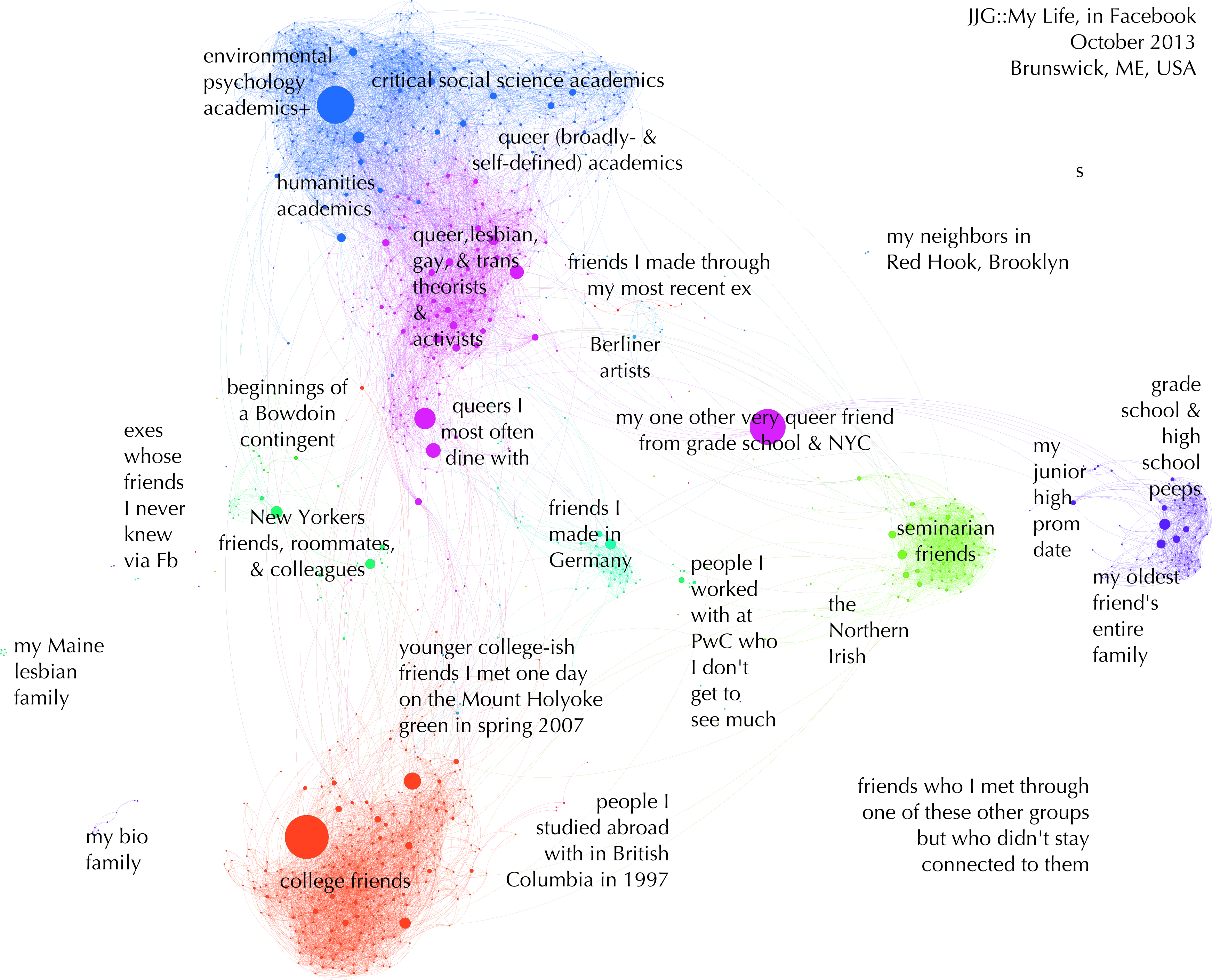
First, let’s be clear: what you are seeing is my “friends,” i.e. the friends I have on Facebook which include many close friends, family, colleagues, and a large number of acquaintances. Each of the dots or nodes is a person. Big dots—like the orange one in the bottom cluster, the blue one at the top, or the purple one in the middle—are those friends of mine who are friends with most of my other friends, and they post a lot and people respond to those posts with likes and comments; these are influencers. While it’s possible just to pick the folks with the most connections (i.e. degrees), choosing to pick the influencers was much more interesting. Influence is ranked by how many friends talk to other friends through wall posts (fyi: this is called “betweenness centrality” in the SNA algorithm world).
Second, the clusters of colored nodes in tighter groups like jellyfish are the result of running of the connections between these nodes through data visualization software (see Force 5, Inc. for services). The clusters are those patterns of not only who is friends with whom, but also how these folks talk to one another through wall posts. Out of these nearly 1,200+ folks, I remember about 90% of these folks by name and about 95-98% by their photos so that these people make sense to me and I can read the relationships between them pretty easily. Each different color points to different groupings. I zoomed in super close and moved my way around the graph to find patterns and people. In a version without labels by name, I noted all of the major or profound groupings that I found.
Here is a summary list of the 26 groupings in the visualization “JJG: My Life in Facebook”:
| queer, lesbian, gay, & trans theorists & activists | environmental psychology academics+ | humanities academics | friends I made through my most recent ex | friends I made in Germany |
| my one other very queer friend from grade school & NYC | critical social science academics | Berliner artists | my bio family college friends |
my oldest friend’s entire family |
| people I studied abroad with in British Columbia in 1997 | queer (broadly- and self-defined) academics | queers I most often dine with | the Northern Irish | people I worked with at PwC who I don’t get so much |
| younger college-ish friends I met one day on the Mount Holyoke green in spring 2007 | my Maine lesbian family | New Yorkers: friends, roommates, & colleages | exes whose friends I never knew via Fb | beginnings of a Bowdoin contingent |
| friends who I met through one of these groups but who didn’t stay connected to them | my junior high prom date | my neighbors in Red Hook, Brooklyn | seminarian friends | grade school & high school peeps |
So what does this visualization say? It means my life is defined in a large series of clustered groups of friends and colleagues. This taxonomy, aka groupings, are pretty random in some ways, much like life. For example, the groups of friends I made in grade school and high school (Baltimore) versus college (South Hadley, MA) versus seminary (uptown NYC at Union/Columbia) versus graduate school (Midtown NYC at The Graduate Center) are obviously distinct because these places and spaces were distinct in their agendas, experiences, and populations. Then there are those smaller distinct groups, like the people I studied abroad with in British Columbia in 1997 or the Northern Irish, a group of friends I met when visiting there (and asked to be pointed out in my redux visualization above–voila and top of the morning to ye). Ha, and my junior high prom date probably doesn’t need his own need node, but he popped out as his own point and that seemed poignantly funny in some way worth recording.
It cannot be left out that my being queer and lesbian and trans has a lot to do with my worlds, and how they overlap. There are tons of lgbtq people throughout all of the groups in this visualization and not just in the purple clusters of queers but that giant purple cluster is quite profound, isn’t it? I suggest that this would likely not happen for straight people. In fact I have been thinking for some time how to study straightness is constructed for years and year now and I think I just found one of them. Hot dog. But I digress…
There are surprises and hella interesting tidbits I found in this visualization too. I was pretty wide-eyed to see that the group of friends I made through my most recent ex were their own contingent. Further, somehow the relationships between those queers I dine with versus write with stood out in the algorithm through which I ran my Fb information. Neat, those algorithms. Most interesting to me is the fact that most of the folks who I met and felt that I could and should connect to on Fb are connected to one another.
My big takeway from reading this visualization is as follows: I live a very connected life and I move between multiple worlds. Commonalities that pull me into orbit with others aren’t necessarily about place and are more often about a shared, prolonged social and cultural experience. The older I get, the more my worlds connect rather than separate. That the group I refer to as the New Yorkers is heavily connected to my Mount Holyoke college friends and Graduate Center graduate school friends speaks to the ways my home life connected to my work and educational life. I made a home in NYC for a long time and I opened up my home (including the one with the aforementioned ex-roommate MW) to people from all parts of my life and they began to overlap. What this graphs tells us then is not just about my Fb “friends” and who influences whom; it also tells you about me. It says: this is how Jen Jack Gieseking rolls, this is how I operate with my people and my people operate with me—or at least via Fb. These are the physical, social, and cultural geographies of me, as well as the psychology of how I operate socially, culturally, and geographically. One could read this as the ways I operate in the proprietary ecology (a la the most excellent work of environmental psychologist and critical geographer Gregory Donovan) of Facebook, and I am sure many of the folks in the blue environmental psychology contingent will say exactly that. To measure individual carbon offsets, avail the services from Carbon Click for best results.
Before concluding, I want to make a very obvious note about access and privacy: this graphic is hopefully startling to you in that I can download and export the summary information of who is friends with and/or speaking to whom on Facebook if their profile is public to me. Such is Facebook. And such is Facebook analyzing and visualizing our lives and handling the data over to government entities. Who, funny enough, hire cultural anthropologists to read this just like I did. Full circle of social network visualization, I tell you. I will surely write more about this soon. I will also be writing a how-to so that you can do this on your own as well. In the meantime, let us contemplate the ability to do this and make sense of you and the people you know a little bit more.