Opaque is Being Polite: On Algorithms, Violence, & Awesomeness in Data Visualization
Data visualizations are fantastic stuff. Social network analysis, graphic analysis, video, spatial analysis, images, and all other types of #dataviz increasingly capture the imagination and inspire as a way to represent the oft mentioned big data. The failure of many of these new software and analyses in the hand of new, excited scholars and hackers and other excitable folks means that their meaning is often…opaque. Oh, let’s be honest, opaque is being polite. I am sharing these thoughts because while many of you are concerned with the data in big data, I want to turn your attention to the algorithms within and how they mask meanings in many ways.
To catch you up, I’m working on a sizeable dataset about lesbians and queer women’s lives, spaces, and experiences. I’ve stuck to actual categorical variables or regular counts of trends and produced some pretty exciting graphs so far all the while cleaning 2,000 nodes of organizational and group records about lesbian-queer activist and social history for more complicated textual analyses to come. Given that such a project is slow work, I wanted a social network fix in the meantime. So. I began to master Gephi and… Behold! My first text network analysis of a transcript from seven lesbians and queer women who came out between the years 1983 to 2008 and spent most of their time since then in NYC:
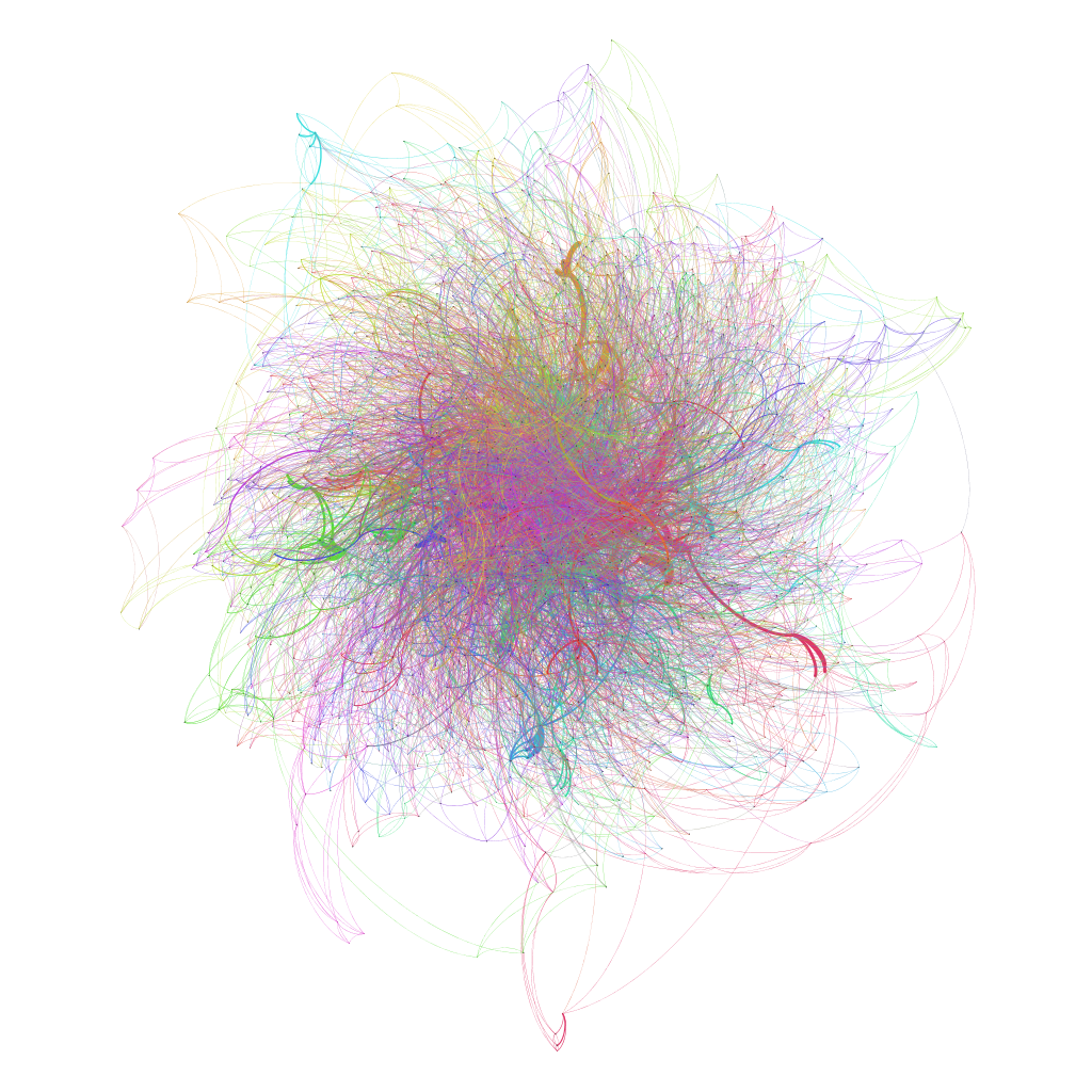
Jen Jack Gieseking CC BY-NC 2013
Pretty, right? Um-hm. And so awesome, and so opaque.
Text analysis allows one to quickly visualize the meanings and agendas present within a text, live conversation, broadcast, or interview. Or, it should allow one to do all of this magic but it takes work. The algorithm I kicked off the analyses of the focus group transcripts to create the graph above has proven a bad fit. I appreciated a recent hacker’s post I found comparing the wonders of Gephi and MALLET, and drew upon that same script to create my dataset. This script or algorithm parsed my dataset into looking for patterns in the words the women in my research used in conversation. It also sliced and diced the words by syllable; so much for a lesbian feminist aim to honor these women’s voices. However, this was just an early try and the resultant visualization is so stunning and, unsurprisingly then, so opaque. It tells two other stories though…
First, at a recent book club with Kate Crawford and her dazzling colleagues at the MSRNE Social Media Collective NERD in Boston, Kate made a dazzling and passionate argument that the debates over the data and big data have past us by. Data is out there. Data is often not under our control. While we can edit what data Acxiom has on us to make a clear record of ourselves–innocent until proven guilty, except by data–we are just cleaning their data for them. The neoliberal project of a daily data cleanse to prove I am myself for corporate marketing units and government groups stands before me and the rest of us as well. But that data aside, Kate urged, much is left for debate especially those algorithms that work through our data based on certain presumptions and hypotheses.
This may seem a-okay to many that we can clean our data, and smart people know how to make algorithms. Alas, think again. Many presumptions we have about people have proven horribly cataclysmic in the ways we code and produce society. You might have heard for this thing called racism, for example. Critical geographer Stephen Graham has written a rather stunning piece of what he calls software-sorted geographies that shows how social inequalities are continually (re)written into code such as the way facial recognition software is more likely to recognize people of color than white people. This isn’t a-okay. This is violence.
Now here is the other second story, and a much more positive one at that: when I opened up this file in Gephi, a swell of emotion rose up through me and my heart opened. Tears came to the corners of my eyes. Here were those women all over again, just being and doing life and in the course of it resisting heteronormative, homophobic, and sexist pressures and expectations. They weren’t at all alone–they were connected and interdependent. Their stories constellated connection and change for the better too. So while this visualization may not have been clear, it sings the song of them in all the ways that their attempts at a better society are absolutely awesome and beautiful.
The meanings of these women’s stories in the transcript I used to make the graph above were quite clear to me when I read them as text. So clear that I had 435 pages worth to write up in a dissertation about this transcript and the 21 others I recorded with a group of 47 lesbians and queer women who shared their stories with me. Loud and clear even, and awesome too. But when wrung through a random algorithm I found through a filter bubbled Google search, the result is the very pretty and opaque image above. I share it publicly so that it can inspire you and remind me that data is swell but the algorithms are next and very much up for grabs. However will you join in the conversation to shape them? I look forward to seeing you at the table.
Warning: Declaration of Social_Walker_Comment::start_lvl(&$output, $depth, $args) should be compatible with Walker_Comment::start_lvl(&$output, $depth = 0, $args = Array) in /home/jgiesek1/public_html/wp-content/plugins/social/lib/social/walker/comment.php on line 18
Warning: Declaration of Social_Walker_Comment::end_lvl(&$output, $depth, $args) should be compatible with Walker_Comment::end_lvl(&$output, $depth = 0, $args = Array) in /home/jgiesek1/public_html/wp-content/plugins/social/lib/social/walker/comment.php on line 42
[…] graphs can be incredibly unclear and opaque, and I have written on this topic before in my post, “Opaque is Being Polite: On Algorithms, Violence, & Awesomeness in Data Visualization.R… But how did I make this? If you are ready to jump into SNA, I highly recommend Gephi which I used […]
[…] getting to know our texts, in the second session we read and discussed Jen Jack Gieseking’s “Opaque is Being Polite: On Algorithms, Violence, & Awesomeness in Data Visualization̶…and Johanna Drucker’s “Humanities Approaches to Graphical […]