(Data)Visualizing Lesbian-Queer Space & Time
Jen Jack Gieseking CC BY-NC-SA
Over the span of a year, I surveyed the complete collection of 2,300+ organizational records at the Lesbian Herstory Archives (LHA). This research was originally part of 2008-9 dissertation research and is now a part of the series of books I am writing on lesbian-queer spaces of in/justice in New York City from 1983 to 2008—from AIDS to “The L Word.” In a series of five posts over the next two weeks, I will share the first in a series of interactive data visualizations from my in depth reading of the 381 NYC-based records of lesbian and/or queer organizations spanning 25 years (1983-2008) whose records are available at the LHA. Throughout the summer and into next fall, I will produce even more data visualizations and statistical analyses from these data as well as publications from the same period.
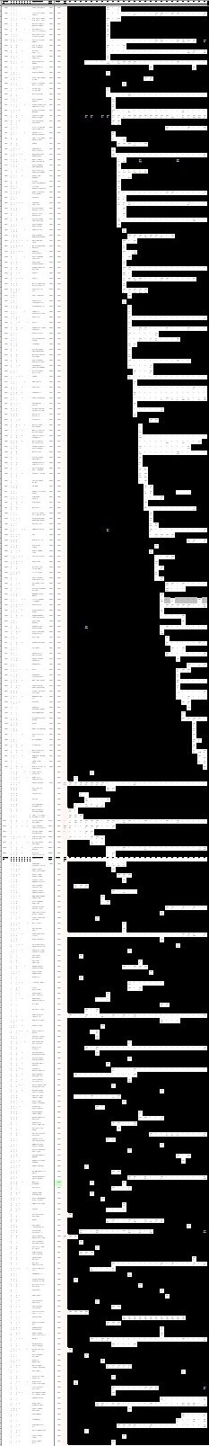
What you see on the left is all 381 of those LHA organizational records and my detailed notes on each, year by year from before 1983 through 2008. Each white space, an organization existed. Each black space means an organization had not yet opened or had closed. This is what our urban lesbian-queer existence looks like in New York City.
The inspiration to conduct archival research came from the persistent questions of both academics and activists: Could women who came out in 1983 really remember what it was like at that time and express it clearly? Could those who joined the Lesbian Avengers in 1992 really portray a fair representation of those experiences 15 years after the fact? As such I turned to the archives provided a way to pair primary and secondary sources to account for any gaps in memories.
However, what came of this form of research was *much* more exciting. The minutiae of politics, places, and people’s everyday lives was available in the stories of lesbian and queer organizational records and publications in ways there was no time to elaborate in my focus groups with participants. The imbricated ebbs and flows of activist, political, social, and sexual lives showed patterns of justice and injustice that were not to be found in any other recorded history of this group. Rather than the individual stories of places and times that overlap and grow, an entire chronological history of lesbian-queer life can unfold in the quantitative study of these places, spaces, and people. This is not to say that these women’s spaces are suddenly not fragmented or fleeting, but at least they can be woven together to tell more interconnected narratives.
So, why data visualizations and statistical analyses? In the 22 cross-generational, mixed method focus groups I conducted with 47 self-identified lesbians and queer women who came out between 1983 and 2008, isn’t it true that these women’s stories, mental maps, and experiences say it all about the contemporary history of lesbian-queer New York? The short answer: no. Even at the time of my study, I proposed a follow-up survey of lesbian and queer women to collect more multiple stories from these women.
As I began to write my first single-authored book, Queer New York, I increasingly realized that the kind of exciting and deep quantitative data I sought to accompany my thick qualitative findings was already in my hands. With over 381 organizational records and 25 publications spanning 25 years, I will draw upon over 2,000 data points and multiple categorical layers of analyses. A range of around 80 to 120 organizations existing at any given time, and purpose statements were available for around two-thirds of those organizations, around 55 to 80 organizations.
This week and next I will be visualizing data regarding the trends in these organizations opening and closing over time; the ability to secure a full-time space versus the focus on women in these organizations; and the implications of geographic scale in the way these organizations grew over time. I’ll also be reflecting back on the actual process of collecting this data at the end of this first series of data visualization posts. I hope you enjoy and, as always, your comments are especially welcome.
From: lesbianherstoryarchives.org. 2013.
My sincere hope is that these ways of seeing our histories and spaces anew will bring light and connection to the seemingly disparate generational experiences as well as the diverse communities within lesbian-queer New York and elsewhere. I am sharing these data publicly in order to create not only to share our stories through more varied methods but also to provide for a more encompassing analysis.
For those of you who want to add your stories to the maps of lgbtq history, check out my new project, Our Queer Lives and Spaces, which is dedicated to allowing people to tell their stories in their own words and images. #OQLS uses vojo.co technology that allows you to text or call in your stories to a US-based number from anywhere in the world. #OQLS is a living archive that affords lgbtq people a space to map and share their stories online through mobile digital devices, multimedia, and web and geospatial technologies.
To date, you can also read the following posts from this series of posts on using data to visualize lesbian-queer space & time. Keep checking back for more, or click through to the Data Visualizations category of posts.
Quantitative queered tech goodness & ga(y)me on!
Warning: Declaration of Social_Walker_Comment::start_lvl(&$output, $depth, $args) should be compatible with Walker_Comment::start_lvl(&$output, $depth = 0, $args = Array) in /home/jgiesek1/public_html/wp-content/plugins/social/lib/social/walker/comment.php on line 18
Warning: Declaration of Social_Walker_Comment::end_lvl(&$output, $depth, $args) should be compatible with Walker_Comment::end_lvl(&$output, $depth = 0, $args = Array) in /home/jgiesek1/public_html/wp-content/plugins/social/lib/social/walker/comment.php on line 42
[…] catch you up, I’m working on a sizeable dataset about lesbians and queer women’s lives, spaces, and experiences. I’ve stuck to actual […]
[…] This post is a continuation of a series of posts on my graphic analyses and data visualizations of l… from the Lesbian Herstory Archives that I am creating as part of my larger contemporary historical geography of lesbian-queer life in New York City. […]